UX CASE STUDY
Plogger
UI design and prototyping an app designed to facilitate identifying and removing trash and debris from one’s favorite places.
Introduction
A Twin Cities think tank developed a concept for an app that would allow users to find and pickup trash in their environment. I was approached to evaluate rough concept prototypes and create design recommendations for the development team.
Research
Cognitive walkthroughs of a rough app prototype and a competing app indicated that the Think Tank’s overall concept of the app being map-centric was sound.
My design team conducted contextual inquiry research, which indicated that two potential users of this software exist: solo trash removal enthusiasts and community event organizers. A prototype was created to serve these users’ needs and bridge the gap between these two user groups.
KEY RESEARCH FINDINGS
- Individual “Trash Hunters” want flexibility when undertaking solo trash collection: Individuals looking to improve their environment wish to multi-task, picking up trash when performing another activity, such as dog walking, running or hiking. Individuals in this situation are limited to low-volume and small item trash collection.
- Cleanup “Event Organizers” can accomplish big jobs: Cleaning up entire parks, handling large waste items or scouring miles of highway can happen in just a few hours with sufficient preparation. An app should support event organizing and execution in as many ways as possible: recruit and motivate volunteers, build a network of volunteers, communicate important event details, etc.
- All users are interested in improving their surroundings and encouraging others to do the same: Users are motivated by improving the spaces they use by presenting those spaces in a positive light. Identifying “wins” are important in the community context: before/after photos, volunteer awards, community social gatherings, etc.
UI Design Overview
 I created a new UI featuring a custom Google Maps API theme (JSON), Plogger logo, color scheme and custom icon sets (view style guide).
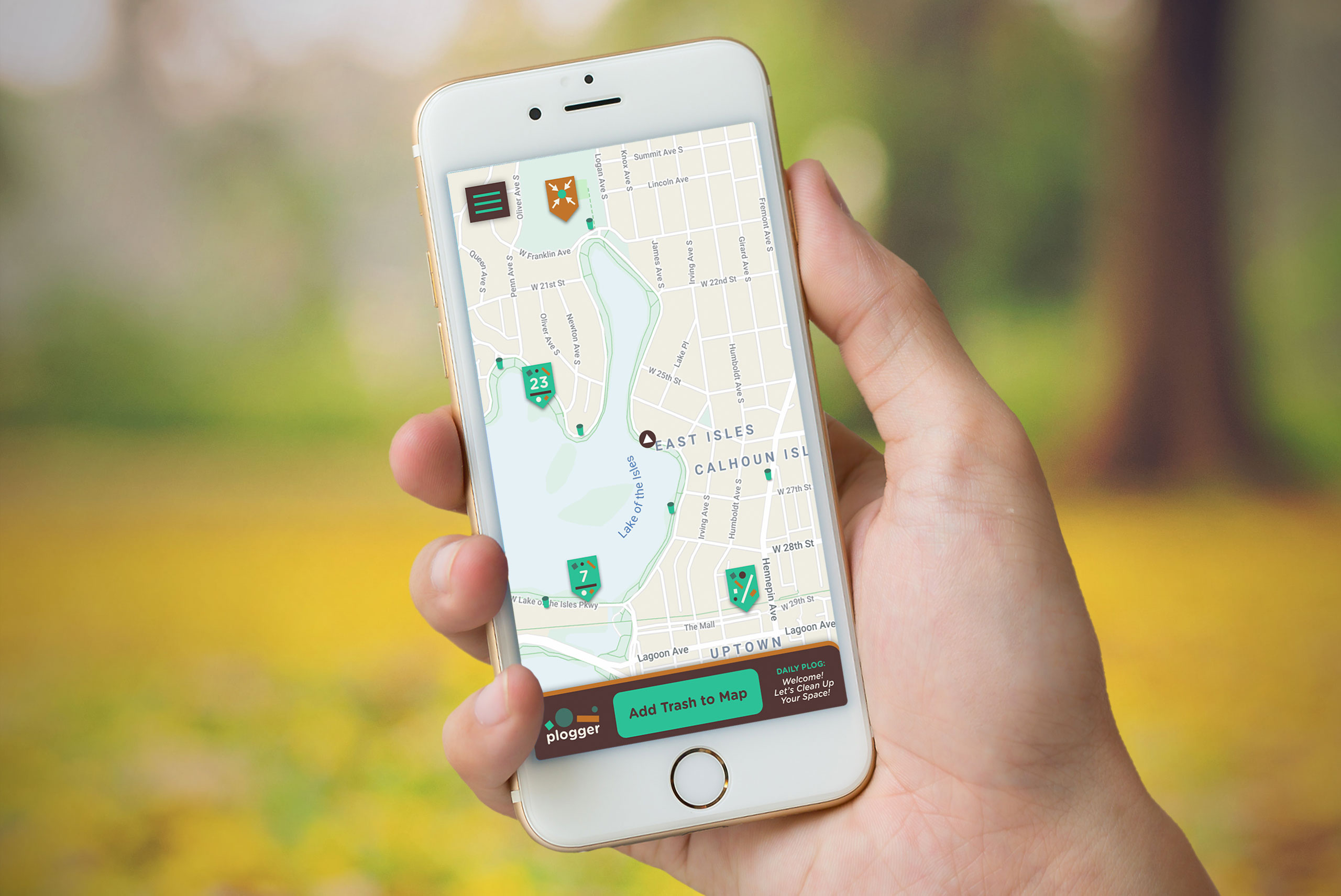
The app UI revolves around an interactive map with pins showing locations of trash and events.
The trash pins show the number of trash entries in that area. When zooming in on these pin clusters, a more detailed view, with individual trash locations would be shown. When sufficiently zoomed out, the clusters would have a unique ability to be turned into an event by clicking a button.
Pin details would be shown to the user via pop-up cards for trash and event locations. Cards have functionality to include before and after photos.
Trash Collector Experience
Trash locations are identified by solo “Trash Hunters”, who place trash locations on the map and use the map to remove trash from those identified places.
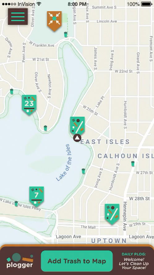
Using the app to place found trash on the map (InVision screen cap).
Trash Hunters are rewarded with points and awards. Awards are automatically assigned based on app use thresholds. Awards can also be given by event organizers to recognize special volunteers.
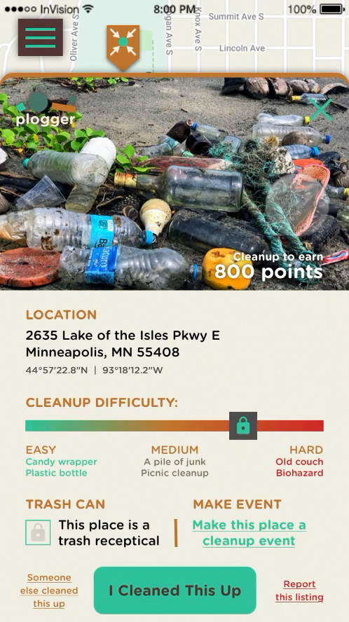
Using the app to pickup trash from a location on the map (InVision screen cap).
Event Organizer Experience
Event organizers can use the app create cleanup events for big jobs, either from scratch or by utilizing software features. If Trash Hunters identify enough trash in one location, the option to make the trash rich location an event appears in the app, facilitating event creation in problem areas.
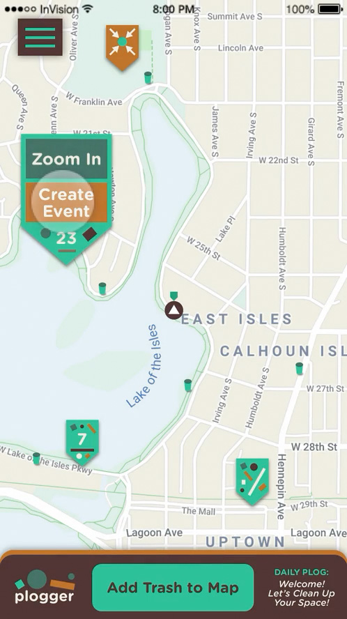
Making a cluster of trash locations into an event (InVision screen cap).
Organizers can use the app to keep track of volunteer involvement and invite them to new events within the app.
Gamification
Points for trash locations would be determined by a difficulty slider, set when the trash is placed. This slider also shows the trash hunter the overall difficulty of the clean up job. Points would also be awarded to users who attend cleanup events.
Awards would be given by the app to users at predetermined set points, as well as by event organizers. Awards and points are shown in the user’s profile card, visible in the slide out menu. Viewing other user’s profile, points and awards would be included in a future design iteration.
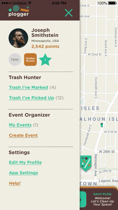
Slide-out menu showing user profile, points and mock awards (InVision screen cap).
InVision Prototype
View the interactive prototype presentation, created with InVision (desktop browser recommended):
Style Guide
A style guide was developed to communicate design language and specifications to the development team.
