UX CASE STUDY
Tevera Site Profile Transformation
User research, customer feedback and technical evaluation transforms frustrating site management experience into multi-phase rollout experience vision.
TL;DR
Product managers started to standardize data collected in a form, which I transformed into an in-product experience with a vision for the future.
Introduction
Tevera is a software product which manages the field experience process for college administrators, site staff and students. The product’s first focus was counseling programs in the United States, but has since expanded into social work and teacher education programs. Tevera counts over 800 university programs as members, with some programs managing thousands of students.
One key product feature, Student Site Placement, allows students to select and apply to internships at eligible sites that fit their interests and needs.
Problem Space
Tevera was bootstrapped and by its founders with the codebase from a previous medical records software product. This document-centric product influenced the crafting of Tevera in ways that were beneficial to the business and detrimental to the user experience.
Among the detriments was that internship sites were added using customizable forms. This allowed members to create a form that worked well for them, and eased their transition from paper-based processes, but also produced duplicates and inconsistent experiences among programs and required extensive support and training. Another related complication is that some site information is displayed and collected in non-form user interfaces throughout the product. These issues and others required a rethought user experience.
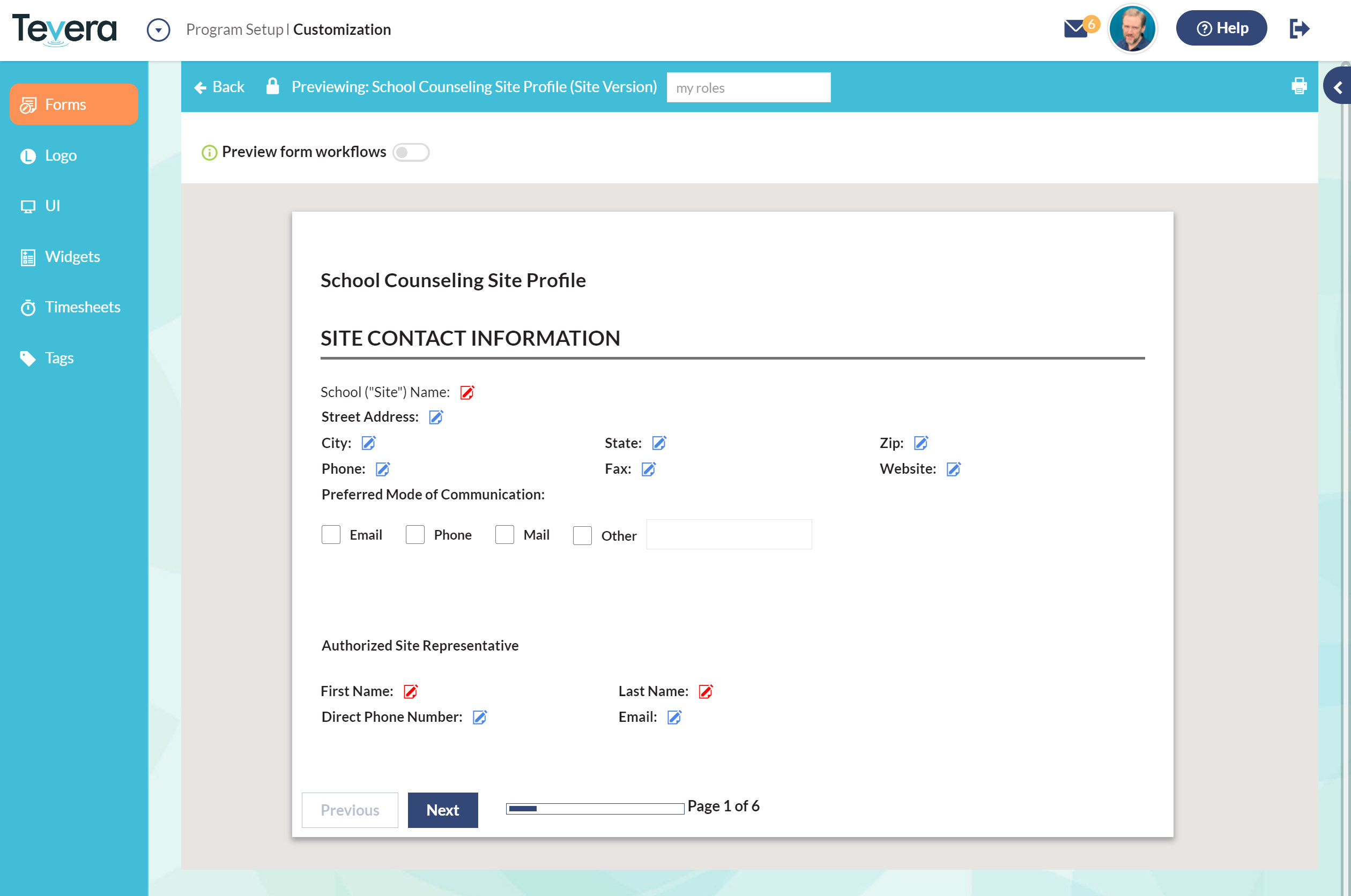
Previous site profile data collection experience.
Research, Feedback and Technical Evaluation.
The redesign was initiated by product managers and started with a review of the current forms and which data was being collected by those forms. At this stage, I became aware of the project and inserted myself as UX designer to ensure a successful outcome.
Using this and other data, I began to conceptualize what an improved site profile experience might become, and how it might be achieved in near and far time frames. I also reviewed previous research projects I had undertaken and examined incoming customer feedback related to the project. I also performed a comparative review of popular and competitive products with site-related features.
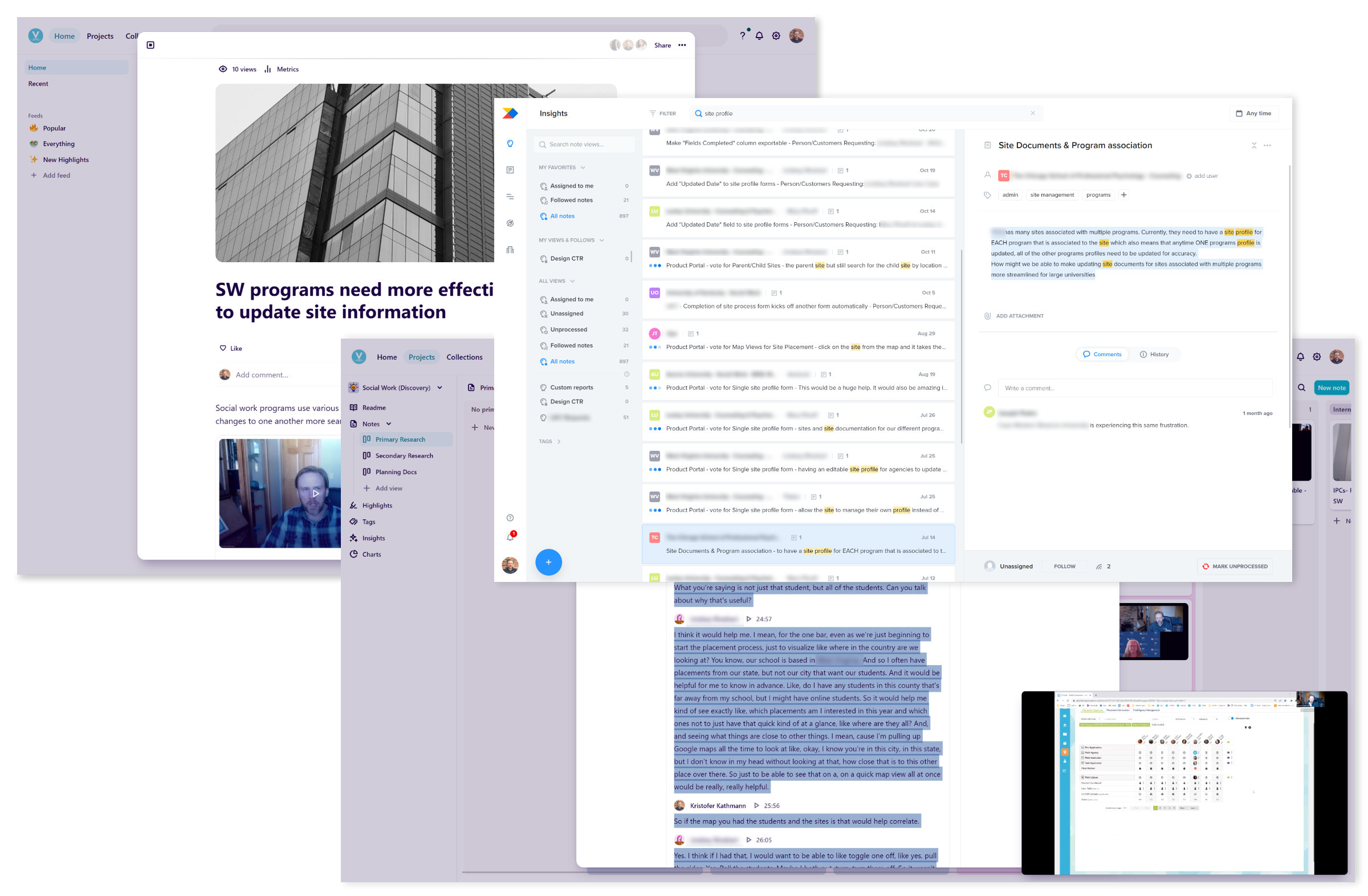
User research and feedback review in Dovetail and Productboard.
Solution Ideation
Given the scope and complexity of the problem, I tasked myself with creating a solution that could be implemented in the near future, with the flexibility to grow and change with the product’s ongoing development. There were many areas and experiences this experience vision will touch and all were considered.
- Students: How will students choose the best site for their field experience?
- Site staff: How will staff review, enter and maintain information about their workplace?
- Program administrators: How will these users maintain site information, and be notified of changes others make? How will the new experience affect the overall management of the program’s field experience?
A key component to all of these is the management and display of diverse and rich site information. This site information should be easy to review and compare with other sites for all users.
Site Profile Experience Vision
After sketching some possible solutions, a prototype of the new site profile was developed, which aimed to achieve several distinct goals:
- Be of high enough fidelity to communicate to internal teams and end users a concept that is very different than the current experience.
- Incorporate several other product initiatives occurring outside of this particular project such as map-based site browsing.
- Show how the design will work through several stages of development.
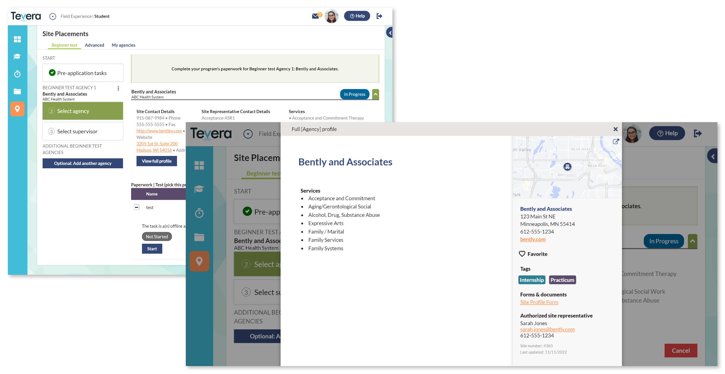
First version of the site profile feature accessed by a button in current table-based browsing, using existing data for immediate roll out.
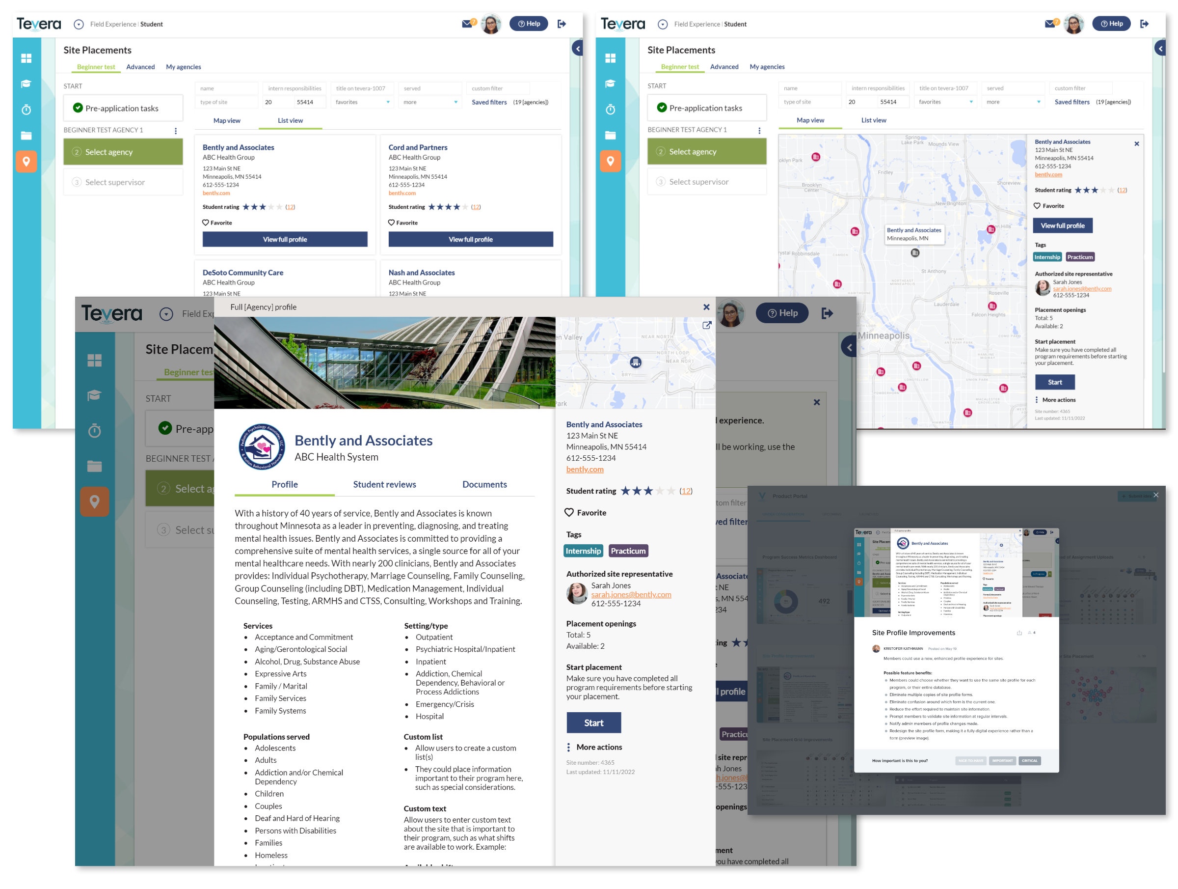
The entirety of the project and others led to a future vision of the product that the team can see and work towards, shown below. This future state not only includes a robust site profile comparable to well known products, but a new site browsing system including map browsing and social proof; concepts which came out of discovery research I conducted.
Experience vision for student site browsing with card and list views and Productboard portal card for feedback.
What’s next?
This experience vision will continue to be refined and developed as the goals of the business and product change. Designs will be adapted based on development capacity, member feedback and direct evaluation with users. There are also some very interesting ongoing problems related to updating and maintaining information to be worked out related to this project.
2/2024 Update: Users continue to adopt the new site profile feature as they adapt to this more efficient process. The inclusion of a Google Maps API in the product has enabled quick rollout of geospatial-related features which I have designed. Contact me to learn about the snowball effect of product improvements this feature has brought for Tevera users.