UX CASE STUDY
Tevera Internship Site Openings Feature
Automating the collection, maintenance and display of internship site capacity.

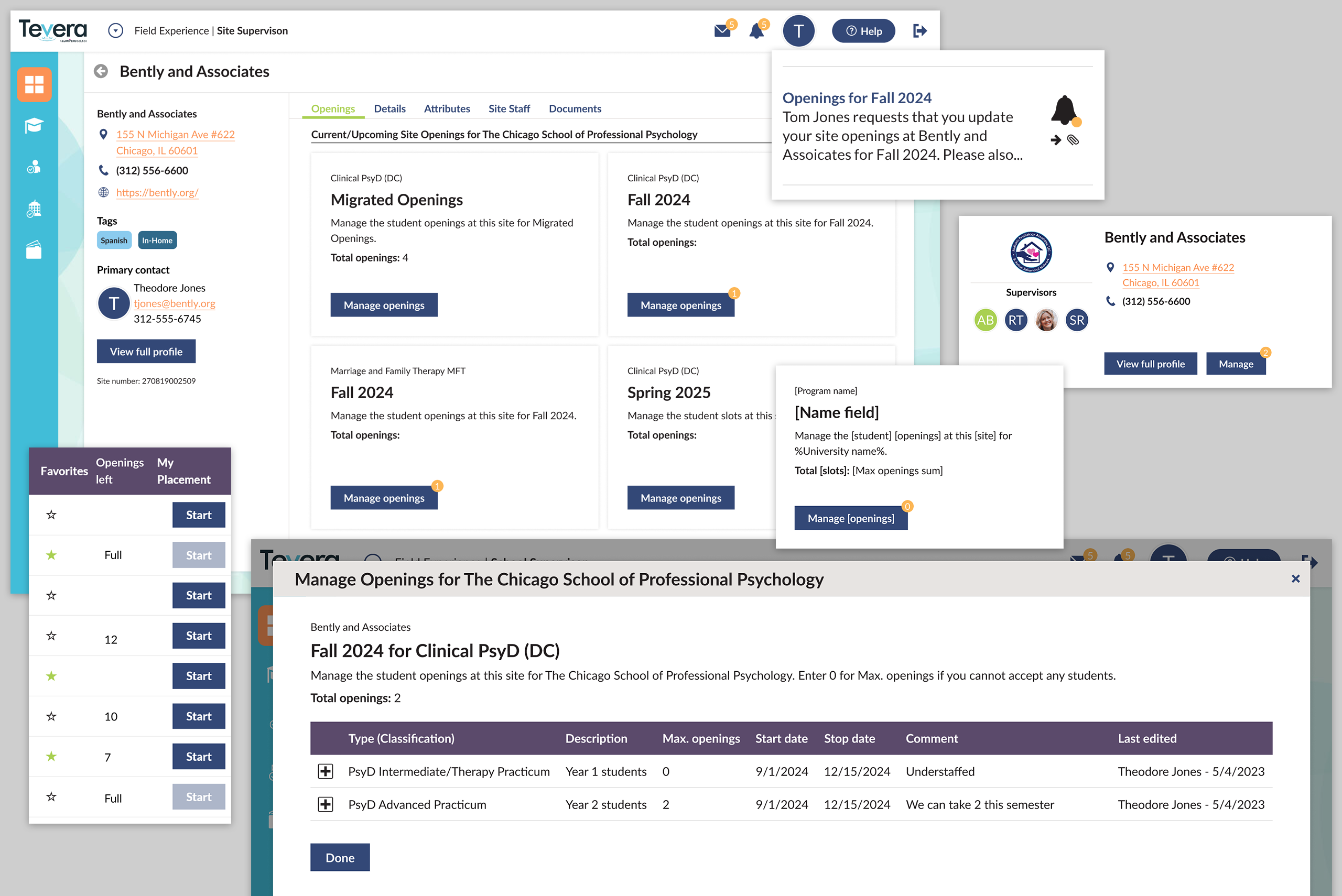
An automatic notification sent to site staff every semester walks them through the simple process of updating how many openings are available per internship level. The openings are used by university staff and students to match with the right field experience opportunity.
TL;DR
I collected user feedback about internship site capacity needs to design a feature that matches students with site capacity, which I then tested directly with users. The deployed feature solved a problem for current users, removed a sales barrier and provided a framework for future strategic goals.
Introduction
Tevera is a software product which manages the field experience process for college administrators, internship site staff and students. A new product feature aims to automate the process of collecting data around how many students internship sites can take in a given time period, such as a semester. The collected data is then used by university programs to place students in the internships that best suit them.
Problem Space
Tevera customers, current and potential, expressed the need for such a feature through product feedback and sales channels. Strategic UX research efforts also determined that a more sophisticated version of the feature will be needed in the future. Several problems and considerations became apparent through this research:
- Staff at internship sites are busy volunteers; an easy to use system with low cognitive load could help drive engagement.
- University administrators need automation to save time and effort when collecting the information.
- Site openings needs vary by university program type, such as counseling, social work and teacher education.
- The design needs to be flexible enough to adapt to strategic initiatives.
User Types Affected
Three distinct user types, or personas, would be interacting with the feature in different ways with the same overall goal: during a specific time period, match students with internship sites that have capacity.
- University Administrators – Internship placement coordinators need to know how many of each type of openings each site in their network has available, so they can place students during specific time periods such as semesters. They would need an interface to set up the feature to their liking, receive notifications of feature use and see how many sites openings are available and currently filled: “Openings filled: X/X”.
- Internship Site Staff – Leaders of clinical sites, social work agencies and schools need to let university administrators know how much internship capacity they have available on a regular basis. They would need an series of notifications to alert them when its time to update site openings and an interface to enter the comments about the openings and how many openings per level are available: “Max. Openings: X”
- Students – Some programs let students drive the process of selecting an internship site. Those students need to clearly see how many openings are available at sites they may be interested in. This need was distilled down to a simple line of text that could be incorporated into their existing site browsing interface: “Openings Left: X”
 Design Highlight: UX Writing Microcopy
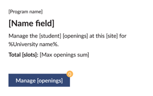
Dynamic data and customized language were used to convey the appropriate meaning to each user type. I carefully crafted microcopy throughout the feature and user notifications to be understandable no matter which university, program or site was interacting with the feature.
What’s next?
Since the feature was designed with future flexibility in mind, several enhancements are already planned, which align with tactical and strategic product goals:
- Develop a feature which allows site staff to manage their own staff in the product, and allow them to match those staff with specific site openings every semester.
- Incorporate more a more granular site openings hierarchy to help achieve strategic product goals.