UX CASE STUDY
Runerra
Journey mapping and new feature wireframing for an app digitizing the “I’m at the store, do you need anything?” conversation.
Introduction
What’s Runerra?
Runerra (now Buncha) is an app that connects people planning to go to a store or restaurant with nearby friends, digitizing the “I’m at the store, do you need anything?” conversation. Buyers who need groceries or other items can request them from Runners by jumping on an upcoming run.
What’s the Problem?
The Runerra team determined that roadblocks to adoption and continued use of the app existed, but weren’t certain how to remove them. Our design team was employed to investigate how the user experience could be improved through journey mapping and new feature wireframing.
Methods Used:
- Competitor Audit: Several competing and comparable apps were evaluated to gain familiarity with the problem space and possible features.
- Directed Storytelling: App stakeholders were interviewed to glean insights into strengths and weaknesses of the app.
- User Journey Maps: The Buyer and Runner journey maps in this report were developed as living documents to guide the design process.
- Feature Cards: Approximately 75 new features were rapidly prototyped by the design team and evaluated for feasibility and value.
- Kano Analysis: A final selection of 11 features were selected for evaluation by Kano analysis.
- Wireframes: Five winning features were developed into the high-fidelity wireframes annotated in this report.
User Journey Maps
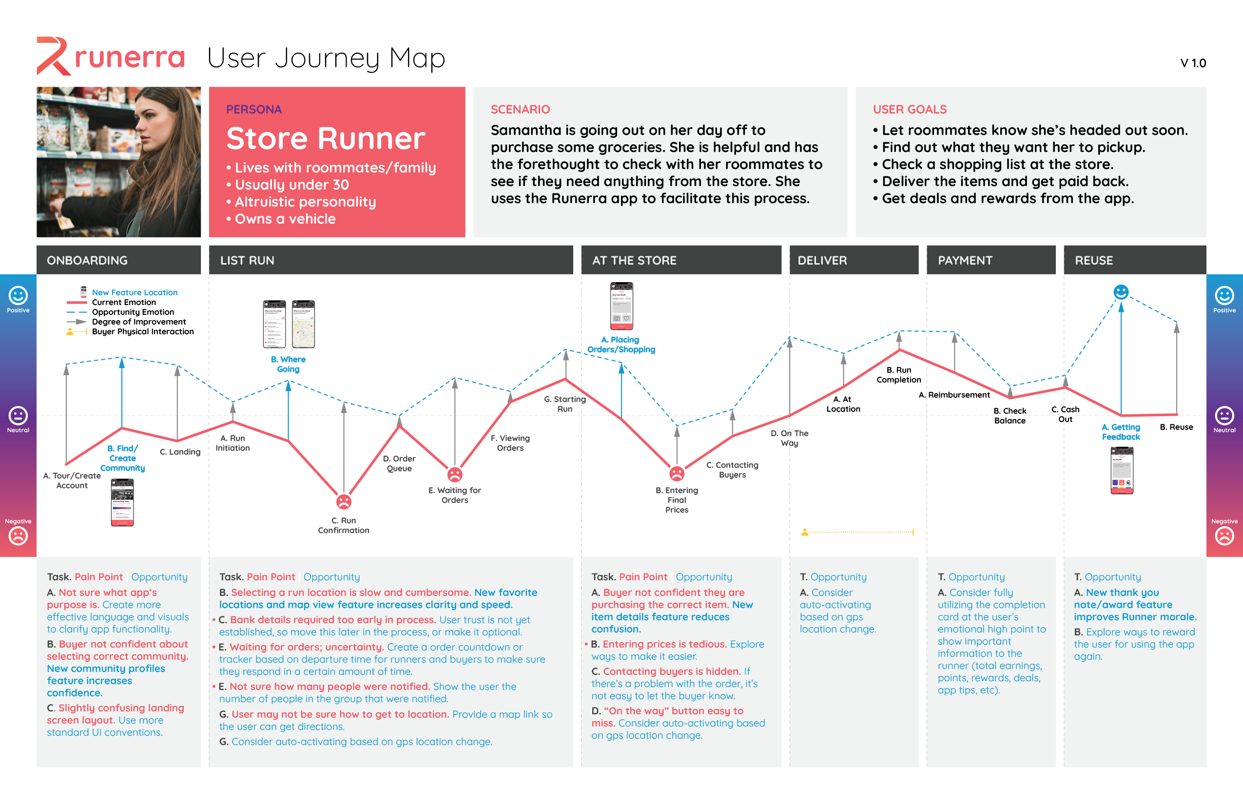
I designed high-fidelity living journey maps in Adobe Illustrator for effective client communication.
Buyers: Users who have a need for store or restaurant goods, but lack the time or ability to get those goods themselves.
Runners: Users who are already planning to run to a nearby store or restaurant and and want to offer friends and family the ability to pick something up for them.
Feature Recommendations
Approximately 75 new features were rapidly prototyped by the design team and evaluated for feasibility and value. A final selection of 11 features were selected for evaluation by Kano analysis. I developed annotated wireframes for five winning features.
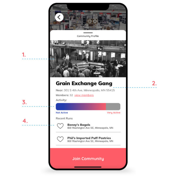 Increased Community Confidence with Community Profiles
- The community can upload a cover photo to show the place, personality or members of the community.
- Communities can set their own name to reflect the community context.
- An activity meter shows potential members what communities are worth joining.
- Recent runs are shown, showing potential members where the community likes to go.
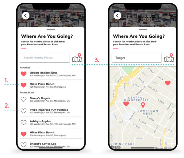 Faster and Easier Setting of Run Destination with Favorites and Map view
- The location search screen features favorite locations for easy recognition.
- Recent runs are also listed, enabling the Runner to recognize a location visited most recently. These locations can be saved as favorites by clicking the heart icon.
- When a location is entered, a list of possible locations nearby is presented. Alternatively, when the map button is pressed, those nearby locations and favorites are shown on a map.
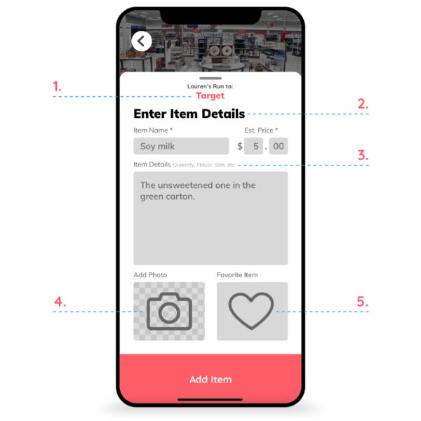 Increased Clarity for Runner with Item Detail Entry
- Clearly indicates the run location so the Buyer recalls to what establishment they are adding items.
- A clear headline clearly indicates the purpose of the card.
- Suggestions for what to enter in the description field to help the Runner purchase the correct item.
- The ability to take a photo of the desired item helps the runner purchase the correct item.
- The ability to add the item as a saved favorite allows the Buyer to quickly reenter items for future runs.
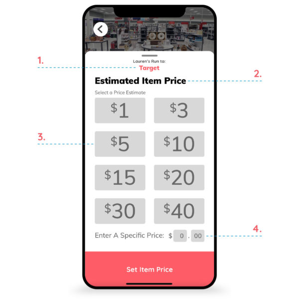 Faster Item Price Setting with Estimated Price Selections
- Clearly indicates the run location so the Buyer recalls to what establishment they are adding items.
- A clear headline clearly indicates the purpose of the card.
- Several commonly accepted price estimate buttons make entering an item price quick.
- The option to set a specific item price is available when needed.
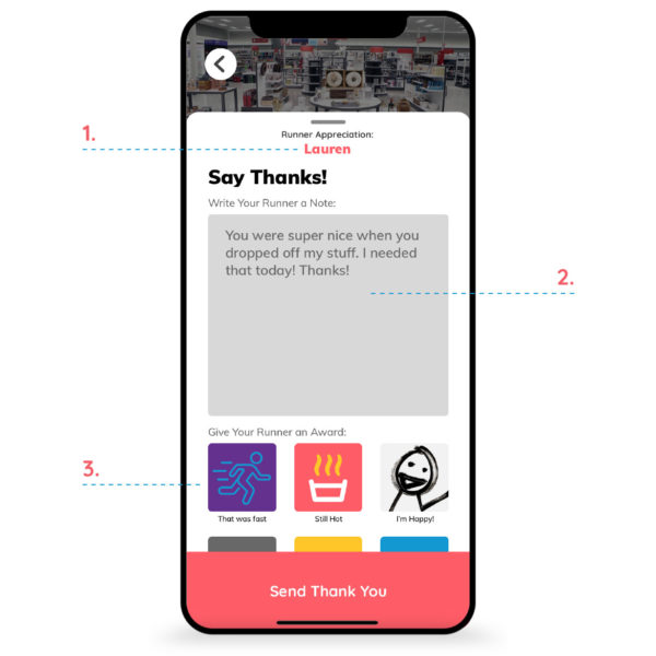 Improved Runner Morale by Sending Thank Yous and Awards
- The Runner’s name is displayed, so the Buyer is confident that appreciation is sent to the correct person.
- A generous text entry field lets the Buyer enter a note of appreciation to the Runner.
- The Buyer can also give the Runner an award, selected from a list.
