UX CASE STUDY
GenEQTY
A brand new, relationship-driven neobank mobile app that adds features as a business grows, while reducing gender bias in commercial lending.
Problem
The financial crisis of 2008 increased the difficulty that small and medium sized businesses face when obtaining commercial loans. This difficulty is increased for women-led small businesses, despite higher rates of growth and return when compared to their traditional counterparts.
Client Challenge
Citing the rise of digital-only, AI-enabled neobanking apps, our client tasked my design team with exploring how the business banking app user experience could be leveraged to solve the funding equality gulf.
Design Team Research
My design team conducted research into the state of neobanking apps, how AI is used in banking and, most importantly, what women-led small business owners need from a business banking platform.
Secondary Research: Competitive audit of neobanking apps, fintech, how AI is used in commercial lending and customer service, etc.
Interviews: Subject matter expert interviews with finance experts, remote contextual inquiries of small business owners, remote user tests of prototypes, mood board evaluations, etc.
Design Team Synthesis & Insights
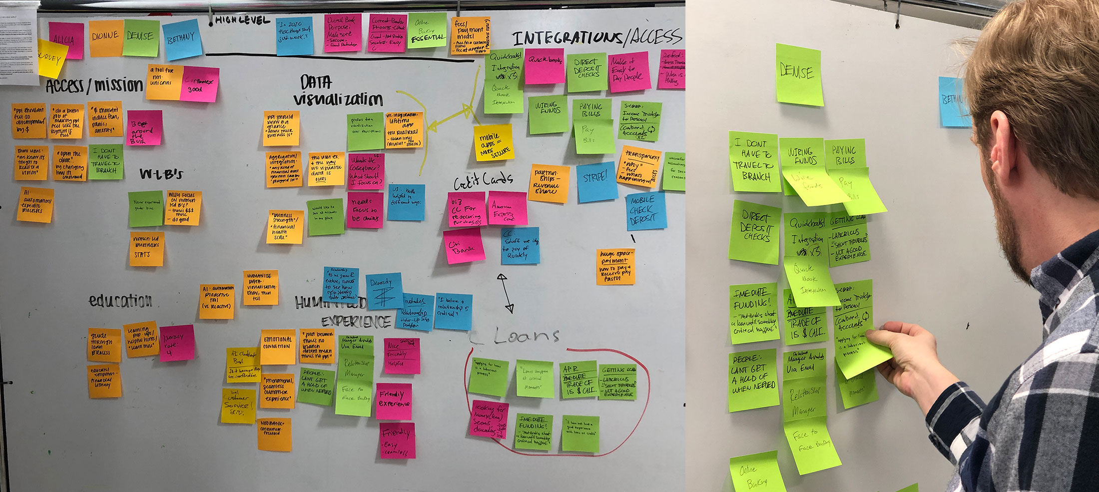
As intake of research continued, a trend emerged; that women-led small business owners value the relationship they have developed with their bank as their business grows. A strong relationship allows the owner to get answers quickly and establish trust over time.
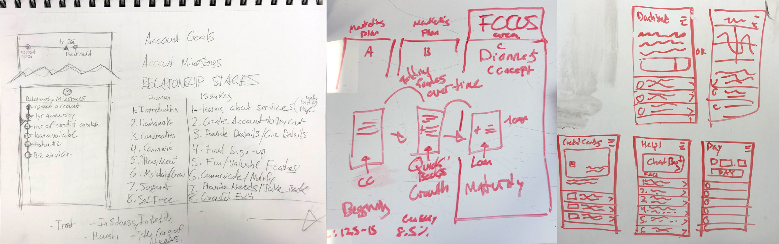
In response to discovered user needs, I hypothesized that a relationship-driven banking app that grew in capability as the user’s business grew could create a novel banking app experience. The client’s goal of seamless lending could be accomplished by weaving user inquiry into the experience over time.
Prototyping and Testing
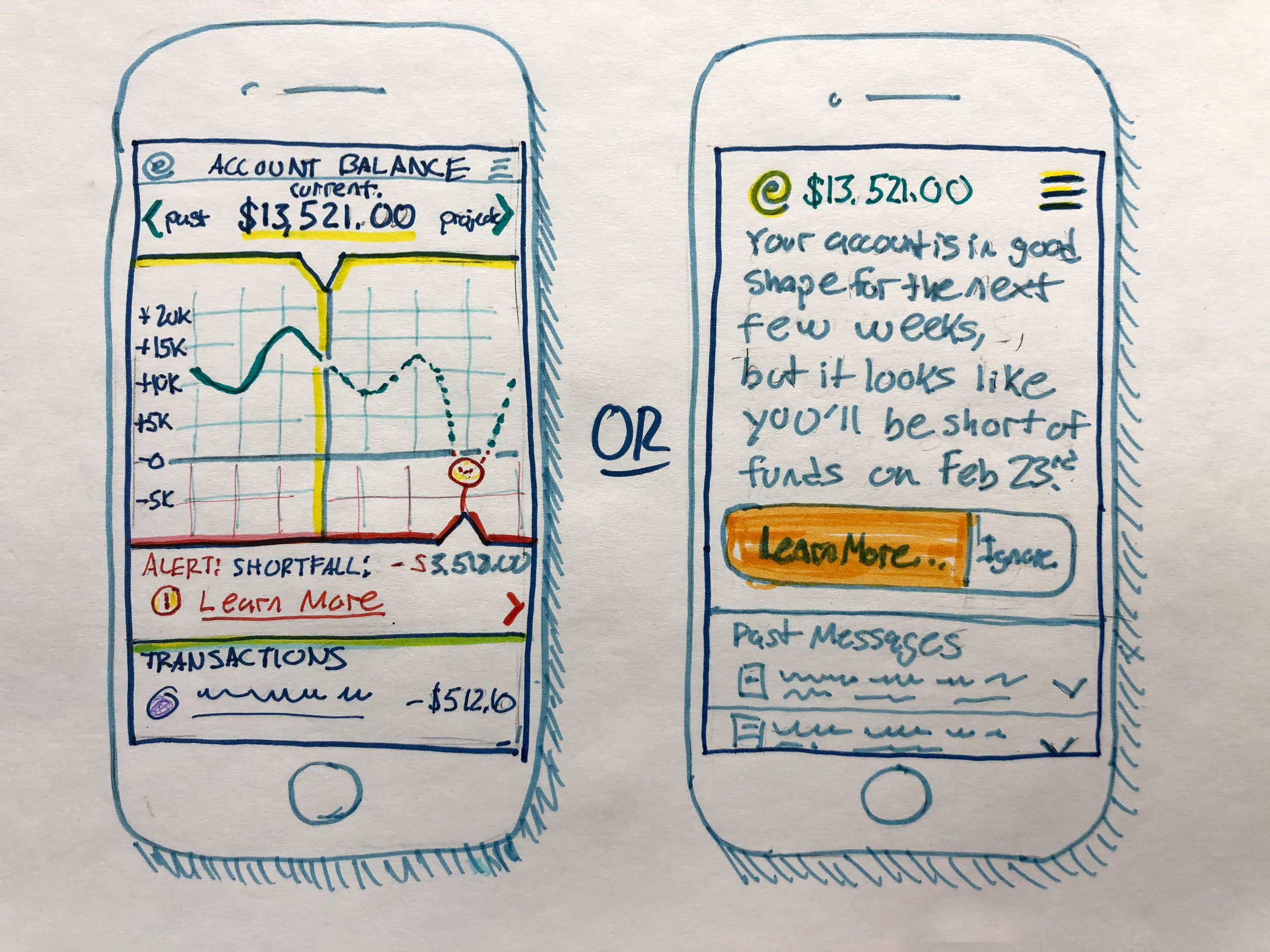
I externalized this hypothesis for testing in the form of low-fidelity sketches and high-fidelity app dashboards that show how the experience changes as a business grows. The prototypes were tested in various mixtures of fidelity to gauge user feedback.
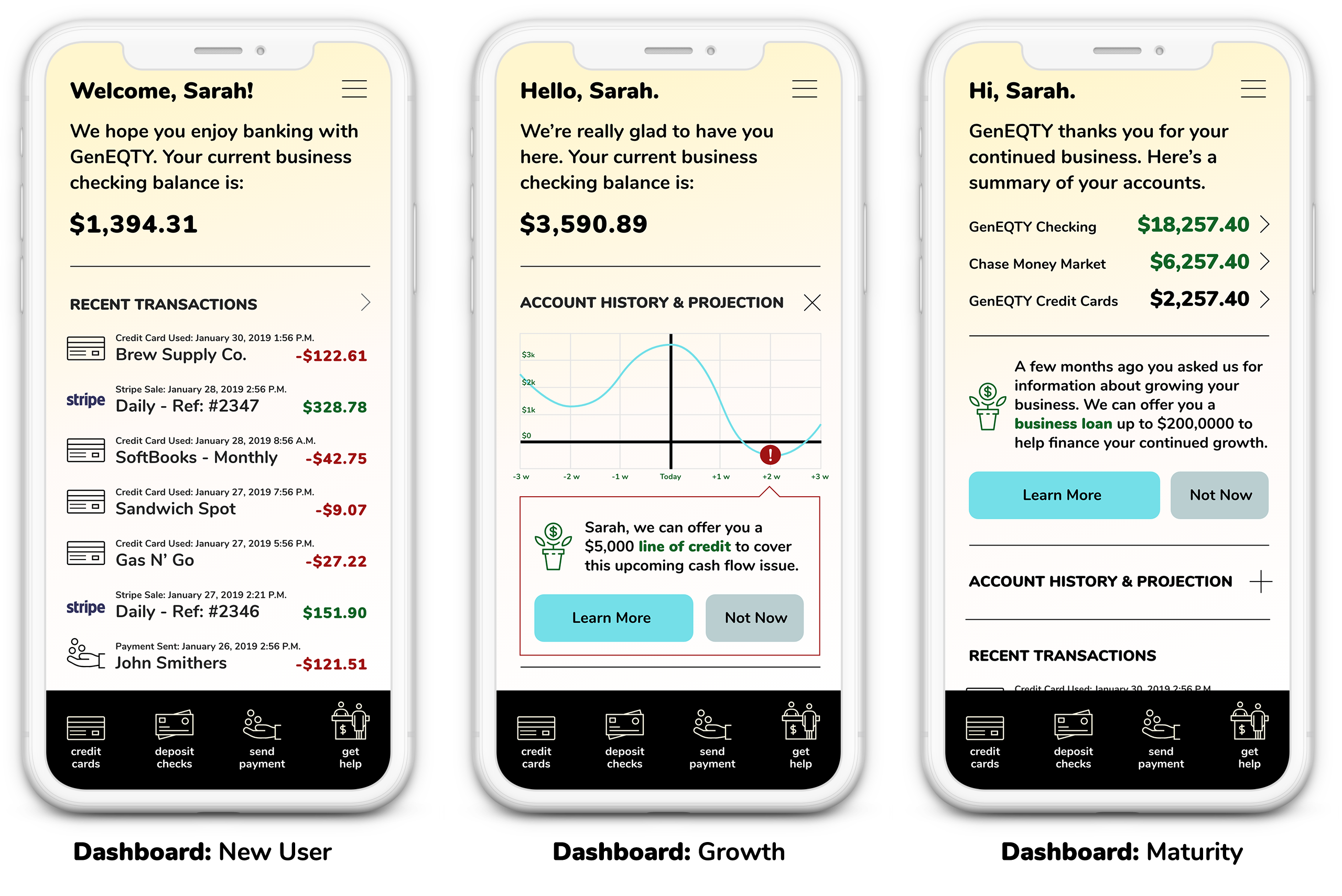
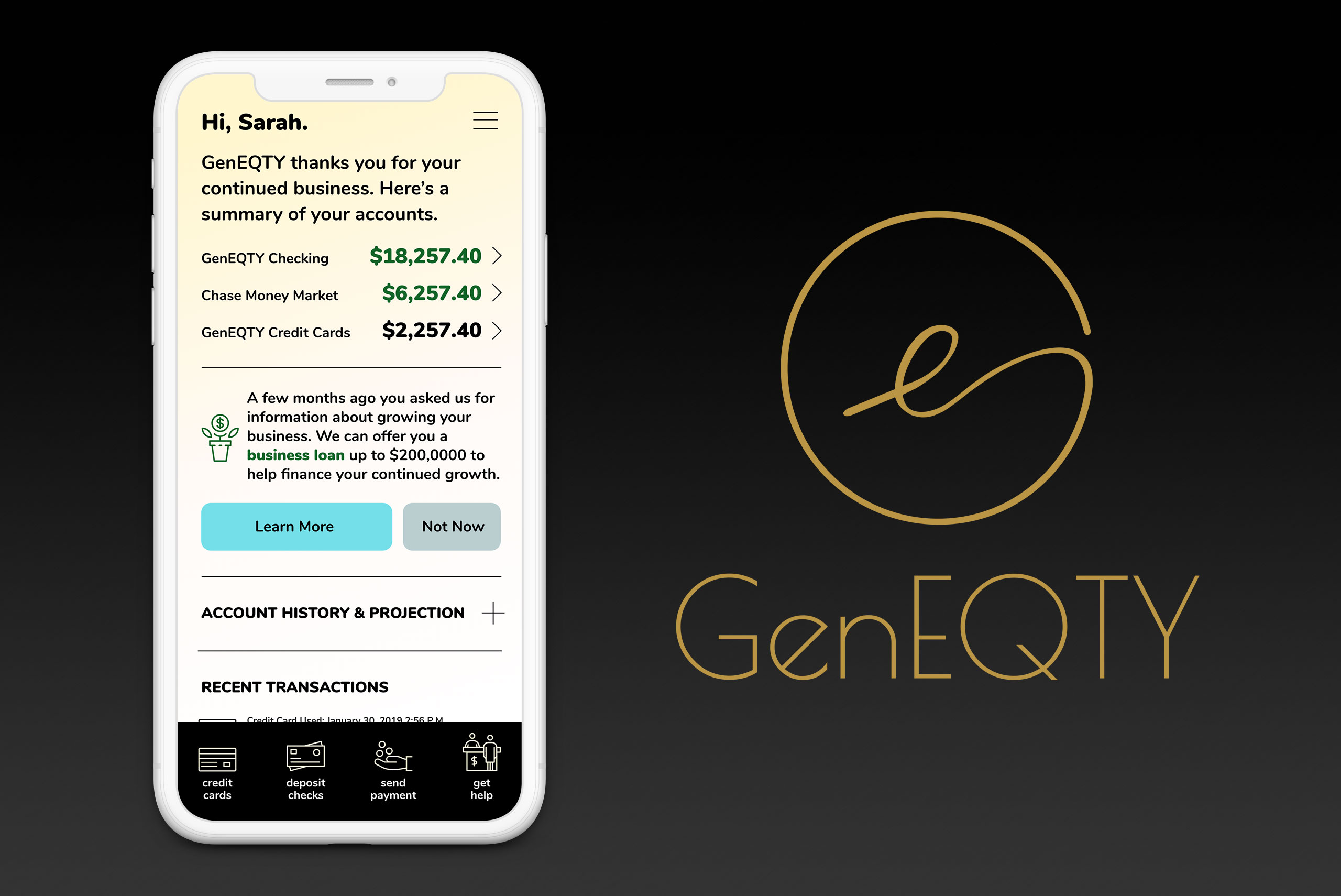
I created high-fidelity dashboard screen concepts to experiment with visual style and screen flow. Three different versions of the experience were developed to correspond with a persona’s business journey.
App Marketing: Landing Page
I created a website landing page to educate potential users and drive app downloads.
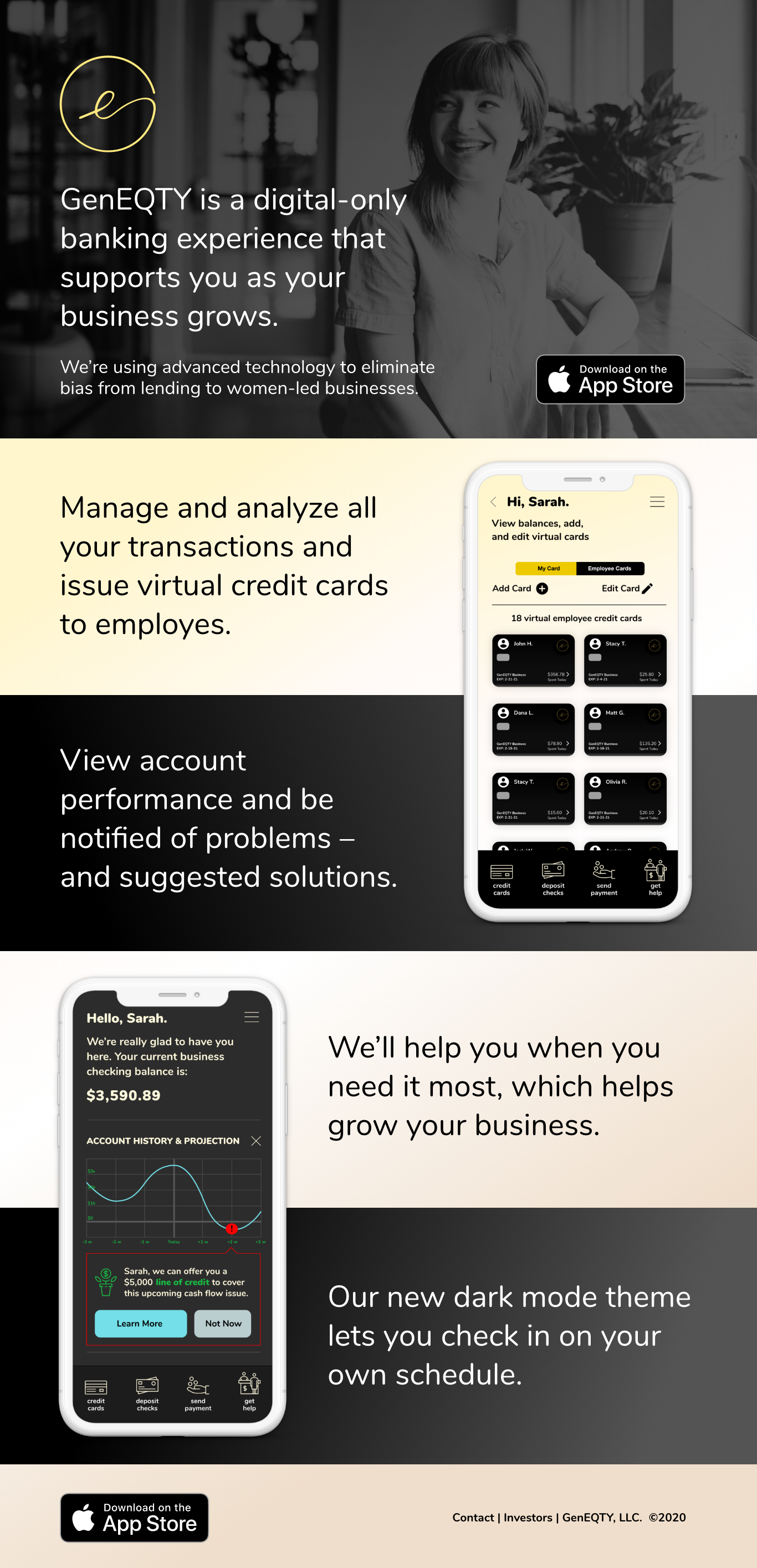
Our research indicated that a dark mode UI would be useful to small business owners who may use their banking app. I developed sample dark mode UI recommendations as shown above.